Analytics and a reporting dashboard can help you understand data.
Data is king, so it only makes sense to find a way to compile this data. Getting and visualizing this information is important.
Enter the dashboard.
Dashboards have been around for a long time. But over time, the amount of information available through them has grown significantly.
Not only that, but the tools available to interpret this data have improved a lot. Data can be critical in the success of any business. But knowing how to make sense of what the data means can be a challenge.
Tools to report data
Having tools at your disposal can make interpretation easier. But what kinds of tools are useful?
Recently, artificial intelligence has become a powerful tool in data analysis and reporting. AI has been useful for many people, across disciplines and industries.
It doesn’t matter what your field is—having tools to help interpret data can be very useful. And having a dashboard to visualize that data is even more helpful.
Using AI technology, reporting dashboards are commonly used to collect, manage, and track data from multiple sources.
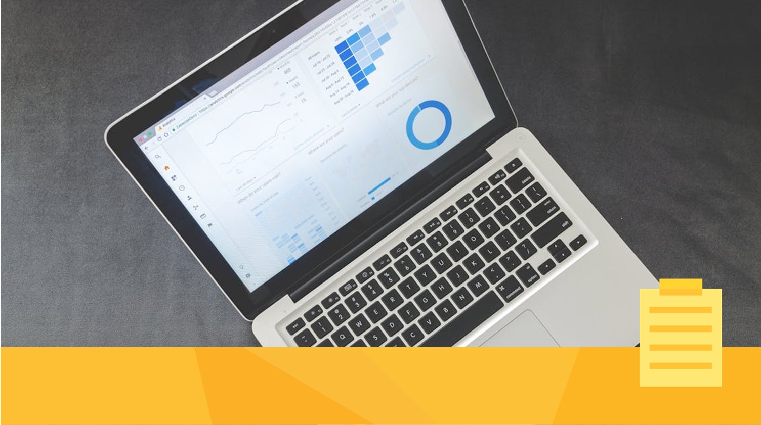
An analytics dashboard is a tool that shows key information in real time. This can be done using visuals, like charts and graphs. This kind of dashboard turns raw data into easy-to-understand insights.
Converting complex data into clear and simple visuals is one of the main benefits of a dashboard. This can make it easier to present data clearly and tailor it to different needs. It doesn’t matter if you’re trying to understand where your traffic is coming from or what manuscripts are getting the most traffic.
Put simply, data from multiple sources can be displayed in customized ways. Your journal will have access to this information, which in turn can inform your decision-making processes.
But what exactly are analytics and reporting dashboards? Let’s address that now.
What are analytics and reporting dashboards?
In a nutshell, analytics dashboards are visual tools that display key metrics and performance indicators.
These can be used in different ways and for different reasons. For example, real-time monitoring and analysis, as well as more future-oriented goals.
By consolidating complex data into helpful visuals, users can see trends, spot pain points, and track progress. By presenting data in an accurate and accessible format, management has important information that can help in decision-making processes.
Need powerful tools to help you run your journal? Let us help.
Saving time through data analytics
Manually sorting data is slow, time-consuming, and can be prone to errors. Reviewing dozens, if not hundreds of data points can result in double counts, missed information, or other such errors. While these might not be massive errors, the more accurate your data is the better.
Mistakes due to human error happen. Dashboards help to overcome this challenge by allowing users to view, manage, and analyze data more efficiently. Instead of going through raw numbers by hand, dashboards give you a fast and easy way to view research data.
Data is about more than numbers and metrics.
Think of the goals you’re trying to achieve, and then use data to help you achieve them. For example, you might want to know how your authors are interfacing with the submission system and what tools get the most use. Another example might be to see how long it takes an author to navigate the submission process. Learning how your authors interact with your system can help make the process easier for them (and for you).
Not only that, but seeing what data is available to you might open up new avenues to improve your internal processes.
What does your data tell you?
What are the benefits of a dashboard?
Dashboards are useful for many reasons. For example, they can give you real-time updates and help you make quicker and more informed decisions. They also increase transparency and can enhance collaboration among individuals on a team (or even teams across departments). When everyone can see all the data, everyone can be on the same page.
With dashboards, team members can spot patterns, trends, or unusual data quickly. This sort of information can help staff at different stages of the publishing process. From submission to post-publication, you can simply know more about your users.
As data is constantly updated, your team can more easily identify and respond to issues and opportunities as they come up.
In other words, a dashboard can help you to derive meaningful insights that are data-driven. Empowering your journal to be more effective and to save time and money.
JAMS empowers your business
JAMS has many tools that can help you to track valuable information. Learn more about all the different ways that JAMS can save you time and money.