Layout design for a manuscript is a critical part of your journal’s entire image. Academic journals need to be clearly legible and easy to understand. Much in the same way that writing needs to be broken up into sentences, paragraphs, and chapters, the same principles are true for layout design elements. Some might say that this is just a “question of aesthetics”—and there is some truth in this—it over simplifies the situation. Layout design is very important for many reasons.
Aside from having a standardized layout that you can apply to all your submitted articles, you need to be able to ensure that the layout is consistently applied. A journal management system like JAMS can help to ensure a consistent application of your manuscript layout across any submitted manuscript. But not every journal uses a management system to help run their journals. In some cases, journals need to handle layout on their own without extra support.
How this is done varies, but it does need to be done.
Here, we’ll cover what manuscript layout actually is, how it impacts different parts of a manuscript, and how good layout impacts a journal.
What is layout design?
In a very general way, layout design is “the arrangement of visual elements on the page”. But why is layout design for manuscripts important? It is a tool, of a sort, that helps overall communication. How layout design works changes from medium to medium, but it usually boils down to moving elements around until you are satisfied with the way something looks. JAMS, for example, has a standard layout design for manuscripts that was carefully designed for its users included in its free membership. But this doesn’t mean that it is the only option—in fact, it is possible Premium users to have a completely bespoke manuscript layout for their journals.
Imagine being able to plan out all the different elements you want for your manuscript design. But then, some journals might not need (or want) this degree of customization and simply opt for the basic design.
When it comes to a journal, however, articles need to be easily understood and look good. Let’s look at three critical elements of a layout design and why they matter: white space, images, and text.

White space
Many might not think of this, but the empty space of a manuscript’s layout matters quite a lot. From reducing visual fatigue to increasing readability, how much “empty” space there is on a page is important.
White space is the amount of space between different design elements. The “empty” space, in other words. This includes, for example, line spacing and margin sizes in a document. Too much white space and a document will feel empty and poorly planned. Not enough space in a manuscript layout, on the other hand, creates a sense of clutter and makes documents harder to read.
If there is too much white space, this can make a document feel empty. If there isn’t enough white space, a document might feel cluttered. These two points create a question: what’s the ideal amount of white space? In truth, there really isn’t a “right” answer here. Usually, you will know it when you see it. This view is quite common in many fields that consider design. Not only that, but the iteration process takes time and feedback is usually critical to achieving a satisfactory result. Make sure to involve multiple stakeholders in the review process—people often have different perspectives that can translate into great recommendations.
In addition to the above, make sure to test your layout on different screens. Smartphones aren’t large 4K displays. What looks good on one might look awful on the other. Make sure that your journal’s design layout looks good on as many devices as possible. Some free submission systems like JAMS have already done all the testing so that you don’t have to.
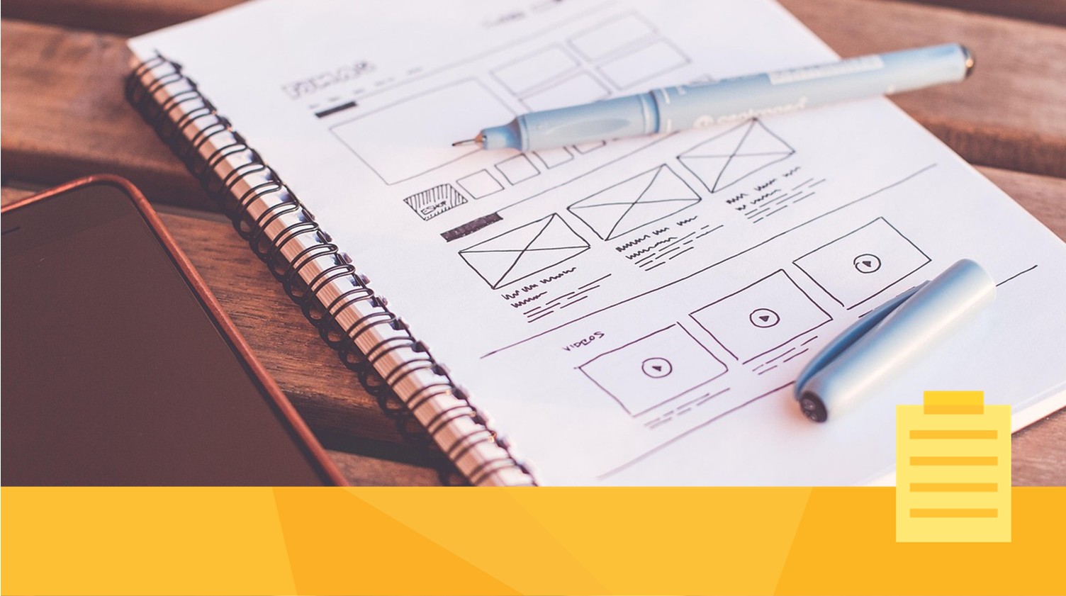
Images
Most academic manuscripts, regardless of the journal they are submitted to, have graphical elements in them. It doesn’t matter if the article is about history, physics, philosophy, or chemistry—visual aides are common.
Because graphical elements are common, your manuscript layout design needs to account for this. Image layout, however, can be a bit more complicated than you might think. For example, because the graphics for a manuscript are provided by the authors, they might be too small. The file sizes could be too large. Or the images might be blurry. There are many possible issues that can come up when trying to process a manuscript’s graphical elements.
It is important for you to ensure that there are expected minimums for these elements. Things like minimum sizes, resolutions, file formats, and more, can be provided to authors in advance to limit time sinks later on. For ideas for how to prepare submission guidelines, we encourage further reading. If you’re not using a journal management system, these guidelines can be extremely helpful.
As noted above, images are a part of manuscript layout design. For example, how you justify your images (left-aligned, centered, right-aligned), the physical size of the image relative to the rest of the document, as well as how you will handle captions. These can all affect the “look” of your publications and so making sure that it all looks good is important. Clear graphics with clear descriptions, properly set in the manuscript can help improve readability and understanding.
Text
Some fonts are broadly considered to be “unprofessional” (Comic Sans commonly, and humorously, being cited as one of the worst fonts). Other fonts might be too difficult to read. Many people might not consider the importance of a font when they want to publish their work. However, journals can sometimes spend weeks or months answering that question.
The trick is to find a font that you like, that feels “clean” and is easy to read. A few simple recommendations might be to avoid fonts that are based on calligraphy (or that have elements of those) as they tend to make text a bit “flowery” and challenging to read. Conversely, basic fonts (Times New Roman and Cambria, for example) are often considered to be “very basic”. There is a balance to be struck, and selecting a good font can work wonders for the way that your articles are received.
Remember, you want the work to be professional, and so taking a look at what other journals are doing might be a good idea. Are they all using the same font (or the same two or three fonts)? If so, you have an easier selection process. If everyone is using different fonts, then you have a bit more flexibility (but more work to do) in terms of selecting the right one for your journal. This is an important element of your journal’s layout.
How does layout design help the publishing process?
Once you’ve determined what your layout will look like, a really good idea is to create a basic template with instructions that authors can use to submit their work to your journal. Free publishing platforms and submission systems often have templates that they’ve established and made available to users. These help simplify the manuscript publishing system, especially for small- to medium-sized journals that do not have massive infrastructure in place to run their journals. These tools help level the playing field and help smaller journals compete in a vast publishing landscape.
Design layout for manuscripts can be automated to a great extent, and make an important stage like layout simple.
Layout isn’t something that you implement during the initial stages of the publishing process. However, basic layout can help improve the odds of acceptance during peer review. If a submission is clear and easy to read, it helps speed up the amount of time that initial screening and peer review can take. If a submission is provided as a “block of text”, it will be your team’s responsibility to try and clean up the submission so that a reviewer doesn’t send it back to you. Remember, the peer review process is crucial to the speed of publication, so you want to make sure that a reviewer doesn’t reject work based on weak layout.
Basic layout can make a difference.
Why layout design is important
We have previously talked about the importance of reputation, but your reputation can be affected by many different factors. While your team’s professionalism, consistency, and standards are highly relevant, along with pricing, other things can impact this as well. Whether or not your journal looks like you’ve made an effort to produce something aesthetically pleasing and easy to read is also extremely important.
Making sure you produce consistently produced content includes the way that content looks. Make sure that you have a layout that you’re happy with for your articles.
Using a journal management system to help with layout
In the same way that securing and organizing English editing for your journal’s articles is important, making sure that layout is done properly is also critical. You want all your journal articles to look cohesive. Everything should look the same, regardless of the content.
But how do you get this work done? Much like English editing, setting expectations is important. Unlike English editing, however, maintaining these standards is actually quite a bit easier. As long as the articles are set up according to the template, it’s as easy as that.
An easy way to make sure that layout is done properly is to make sure that your team is familiar with the template and can quickly format any submission to those standards. A journal management system can help you to assign these tasks to a team (or individual). Empowering your team with valuable tools is one of the best ways to make sure your journal is successful.